iTunes Rating Distribution
-
Comments:
- here.
As an adjunct to another project I am working on (basically an extended version of the experimental writeup I did about iTunes Ratings), I had cause to wonder as to the distribution of ratings in my iTunes library, and in other peoples. I may be unusual in that when I import an album, I grab the whole lot. Even if I really only like one track. I just feel some day I may want to listen to the whole lot! Anyway, I came up with the following script to get the data. Mac only, I’m afraid. Possible to write a much slower version that scans the XML file manually, but I’ll leave that as an extension to the avid reader.
    #! /usr/bin/env python

    import Foundation # Required PyObjC installation.
    import os

    library =  os.path.expanduser('~/Music/iTunes/iTunes Music Library.xml')

    db = Foundation.NSDictionary.dictionaryWithContentsOfFile_(library)
    tracks = db[u'Tracks'].itervalues()

    ratingcount = {}
    for i in range(101):
        ratingcount[i]=0

    for track in tracks:
        try:
            ratingcount[int(track[u'Rating'])] += 1
        except KeyError:
            ratingcount[0] += 1

    fp = open('RatingData.csv','w')
    for i in range(101):
        fp.write(str(i)+","+str(ratingcount[i])+'\n')
    fp.close()
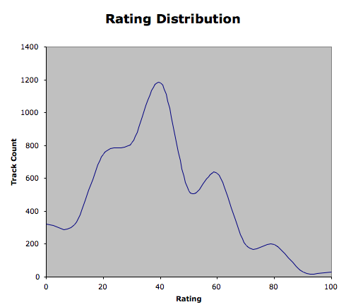
Plotting this data gives the following graph: 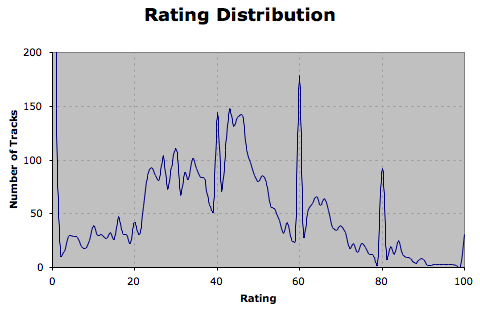 Clearly, there are a couple of spikes, most likely from having rated tracks initially on a normal iTunes scale (0-5 stars). I’ve changed the plot scale so you don’t see the zero-rated tracks, as they skew the data totally, and most of them are in fact unrated, rather than zero rated. If I scale my ratings down to full stars (and discard all of the unrated tracks), then my data looks more like:
 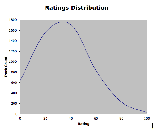 Which is what I expected. And shows that I am probably pretty harsh on my music library - or I dislike most music a bit. • The final plot shows when rating as half-stars, that is, rounding down to the nearest 10, and discarding unrated tracks.