Optus Billing Misleading Chart
-
Comments:
- here.
I really hate when people use charts or graphs in a misleading manner. It’s even worse when it’s big companies, and in my latest bill from Optus, I noticed a particularly egregious chart.
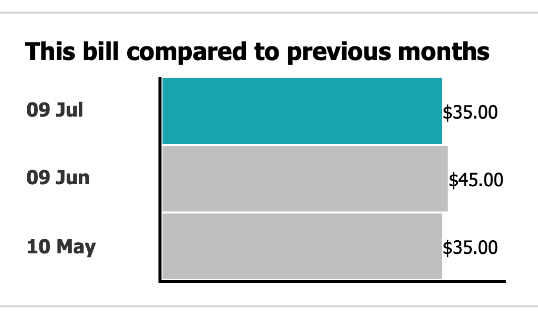
For those that don’t notice at first (it’s taken me a bunch of billing months to notice, actually), the middle line is slightly longer than the other two. In that week, I went over my data plan, and had to pay an extra $10 to get more data.
I don’t have a problem with this, but I do have a problem with the scaling on the axis.
The shorter ones are months where I was billed $35. The longer one is where I was billed $45.
That’s a difference of $10, which is ~30%. However, the middle bar in the chart is not even close to 20% longer. It looks to me to be around 20 pixels longer, or around 3.5%
So, when you overspend on your bill, it looks like you are only paying a small amound extra, when in fact I am paying a significant amount more on that given bill.
The only way you could have scaling like this would be if you had a logarithmic scale. Which, granted, many more people are familiar with now than before the pandemic, but you don’t use a logarithmic scale when your values are all of the same order of magnitude, unless you want to mislead people.
I find it pretty unlikely that a high proportion of Optus’s customers have a monthly billing variance that differs by orders of magnitude. I also find it pretty unlikely that this is a mistake - someone at Optus (and I suspect not someone in their tech department, great work dumping on them chat support person) has decided that their charts should be tweaked so that overspends look like they are “not that big”.
Who wants to bet Optus never get back to me about my complaint?